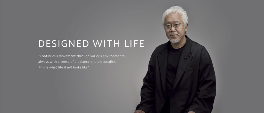
The renowned Chinese tech company Xiaomi is famous for its weird and wonderful gadgets and are quite known for their innovative experimenting. Recently they held a ‘Mega Launch Event’ to reveal their new logo that was under-progress for the last 3 years. The designer of the same is a famous Japanese artist Kenya Hara who used his philosophical thinking to enhance the logo. This information is enough to hype up the people for its new launch, but they were not prepared for the disappointment that they received.
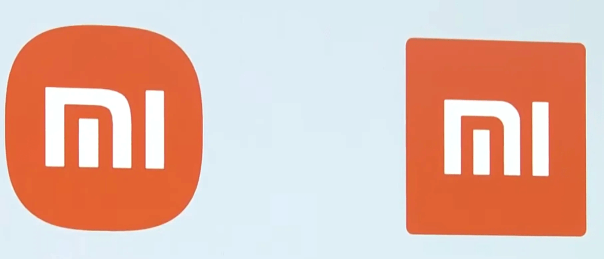
The new logo became a matter of laugh instantly and netizens were having difficulty while spotting the difference between the old one and the new one. Interestingly, in their Mega Launch Event, they spent about 20 minutes explaining how the complete process of changing their logo and how they turned a square into squircle.
The celebrated Japanese artist, Kenya Hara, and his team curated a total of 24 logos to find the middle-ground between a square and a circle. They used the power of mathematics to determine the best logo suitable for Xiaomi and ended up selecting n:3 from the image below.
By commenting on the new logo and people’s disappointment with it, the CEO of the company, Lei Jun said, “Are you disappointed that at this logo, that we made our new logo rounder?”
He also further shared that, with their new logo they didn’t just change its shape to a rounder form from a square but it also represents the internal spirit as well as the identity of the brand.
However, the netizens were still not convinced and were making all sorts of memes on Xiaomi’s new logo. They also said that the company needs a refund from the artist behind this redesigning as they literally can’t spot a difference even after the 3 years of work. Please share your thoughts on the same by commenting in the comment section below.
Read Also: Finally! Giant Ever Given Ship Stuck At Egypt’s Suez Canal For A Week Floats Again
